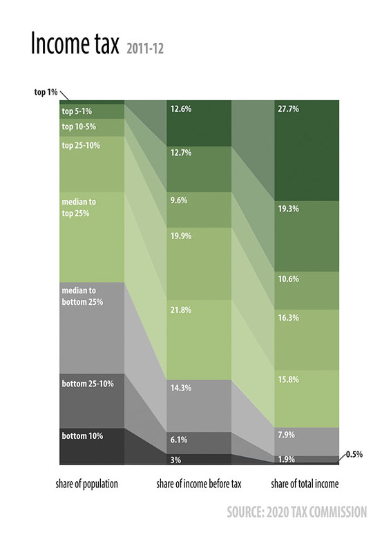
In the first of our infographics series, taken from our Fiscal Factbook, we illustrate the share of national income (middle column) that is earned by various income groups (left column) and the share of income tax that those groups pay (right column):
 In the first of our infographics series, taken from our Fiscal Factbook, we illustrate the share of national income (middle column) that is earned by various income groups (left column) and the share of income tax that those groups pay (right column):
In the first of our infographics series, taken from our Fiscal Factbook, we illustrate the share of national income (middle column) that is earned by various income groups (left column) and the share of income tax that those groups pay (right column):