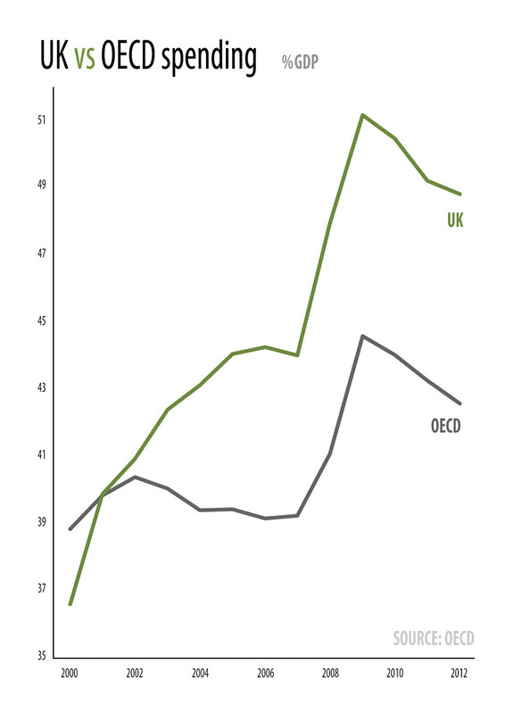
This infographic from our Fiscal Factbook illustrates the growth of government spending in the UK since 2000 and contrasts it with the OECD average:
 This infographic from our Fiscal Factbook illustrates the growth of government spending in the UK since 2000 and contrasts it with the OECD average:
This infographic from our Fiscal Factbook illustrates the growth of government spending in the UK since 2000 and contrasts it with the OECD average: